4.2.12 Heatmap
4.2.12.1 Overview
The Heatmap aggregates time-series data into a two-dimensional grid where the X axis represents time, the Y axis represents value ranges, and the color intensity of each cell indicates the density (count) of data points in that range. It is an effective tool for analyzing how a value distribution evolves over time, revealing distribution drift, periodic patterns, and periods of abnormal volatility. The Heatmap supports only a single metric.
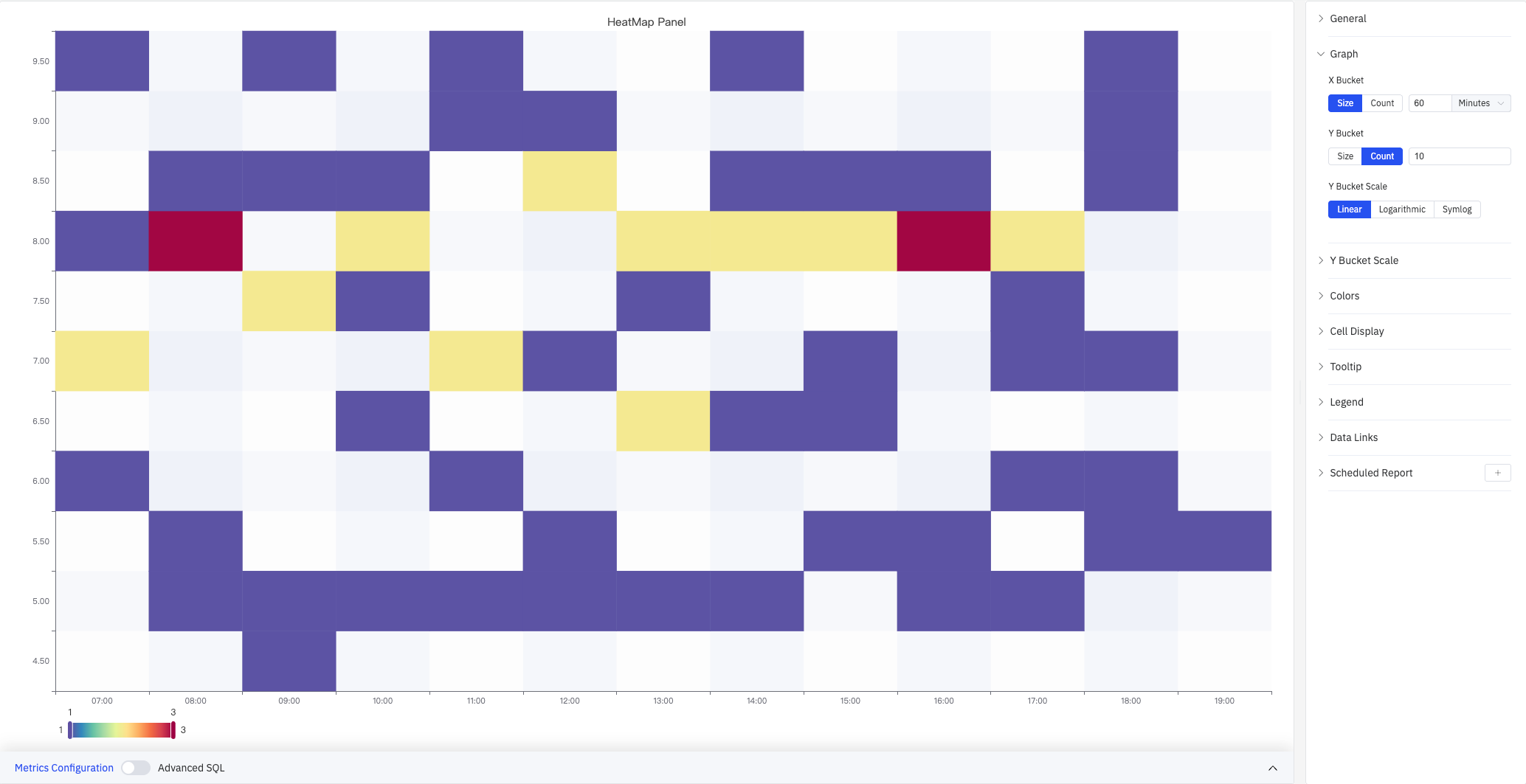
The screenshot shows the HeatMap Panel with time range 07:00–19:00 on the X axis and values 4.5–9.5 on the Y axis. Colors range from blue (low density) to red (high density), with a scale of 1–3. The right panel shows the Graph section expanded with X Bucket (Size, 60 Minutes), Y Bucket (Count, 10), and Y Bucket Scale (Linear). The remaining configuration sections are listed collapsed: Y Bucket Scale, Colors, Cell Display, Tooltip, Legend, Data Links, Scheduled Report.
4.2.12.2 When to Use
Use the Heatmap when:
- You want to observe how the distribution of a process variable changes over time (distribution drift)
- You need to find recurring patterns, such as which time periods concentrate values in certain ranges
- You want to see the overall distribution of a large number of data points without being overwhelmed by individual point details
4.2.12.3 Configuration
Graph Settings
Graph settings control how data is bucketed along both axes and how the Y axis is scaled.
X Bucket and Y Bucket can each use one of two modes:
| Setting | Description |
|---|---|
| X Bucket mode | Size (each column spans a fixed time width) or Count (divide the time range into a set number of columns) |
| X Bucket size / count | For Size mode: enter the width and unit (e.g., 60 Minutes). For Count mode: enter the number of columns (1–500) |
| Y Bucket mode | Size (each row spans a fixed value width) or Count (divide the value range into a set number of rows) |
| Y Bucket size / count | For Size mode: enter the numeric width. For Count mode: enter the number of rows (1–500) |
Y Bucket Scale controls the type of Y axis scale:
| Option | Description |
|---|---|
| Linear | Uniform linear scale (default), suitable when values do not span multiple orders of magnitude |
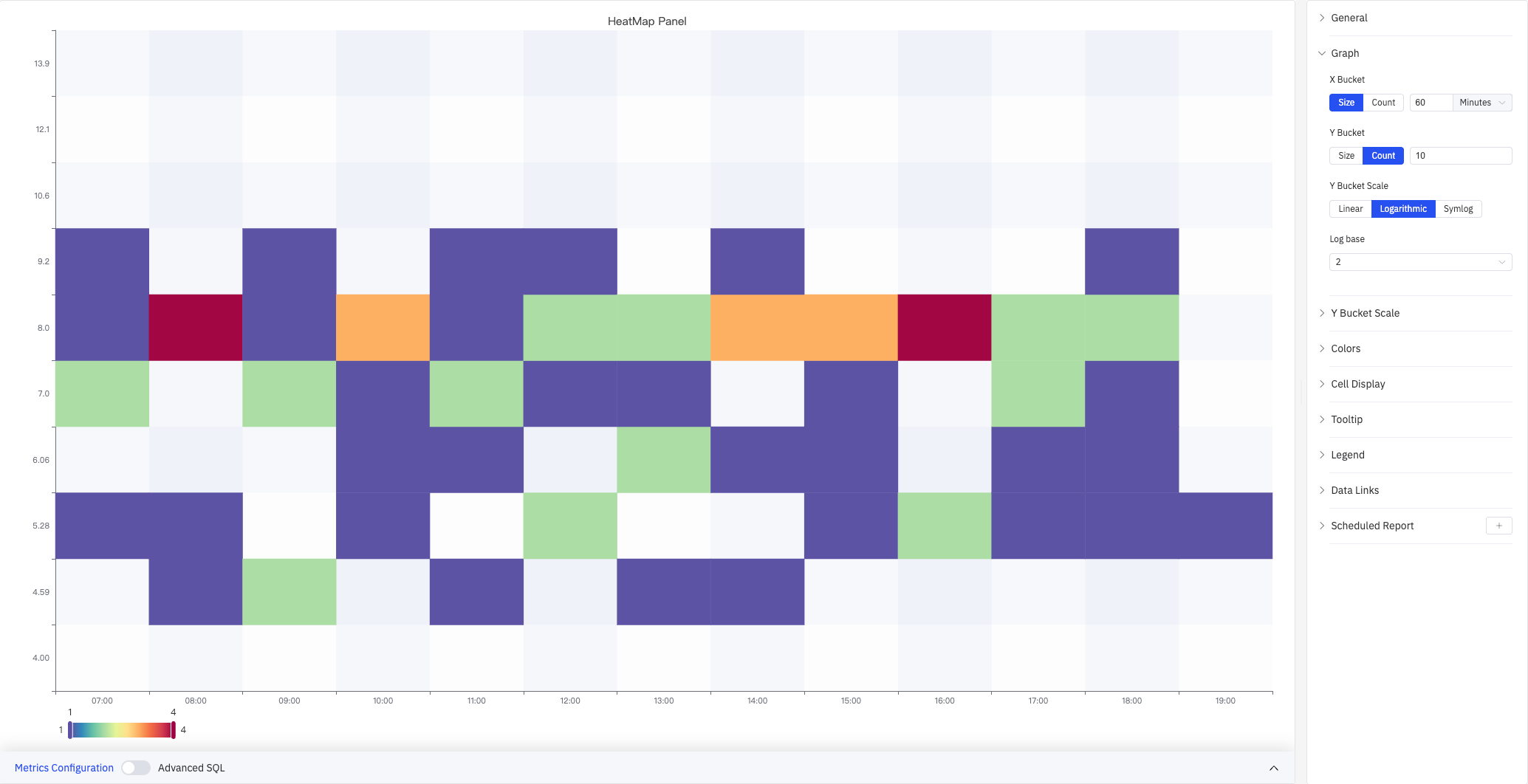
| Logarithmic | Logarithmic scale. The screenshot below shows Log base=2 with non-uniform Y axis spacing (4.00–13.9) |
| Symlog | Symmetric log scale: linear within the Linear threshold, then logarithmic beyond it |
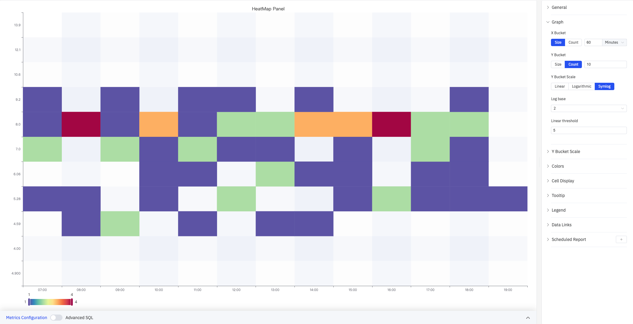
Symlog maintains uniform spacing within the linear threshold range, which is useful for datasets that have both a dense small-value region and a sparse large-value region. When Logarithmic or Symlog is selected, additional settings appear:
| Setting | Description |
|---|---|
| Log base | Base for the logarithmic scale: 2 or 10 |
| Linear threshold | The boundary below which the scale stays linear (Symlog only) |
Y Bucket Scale
The Y Bucket Scale section controls the visual appearance of the Y axis:
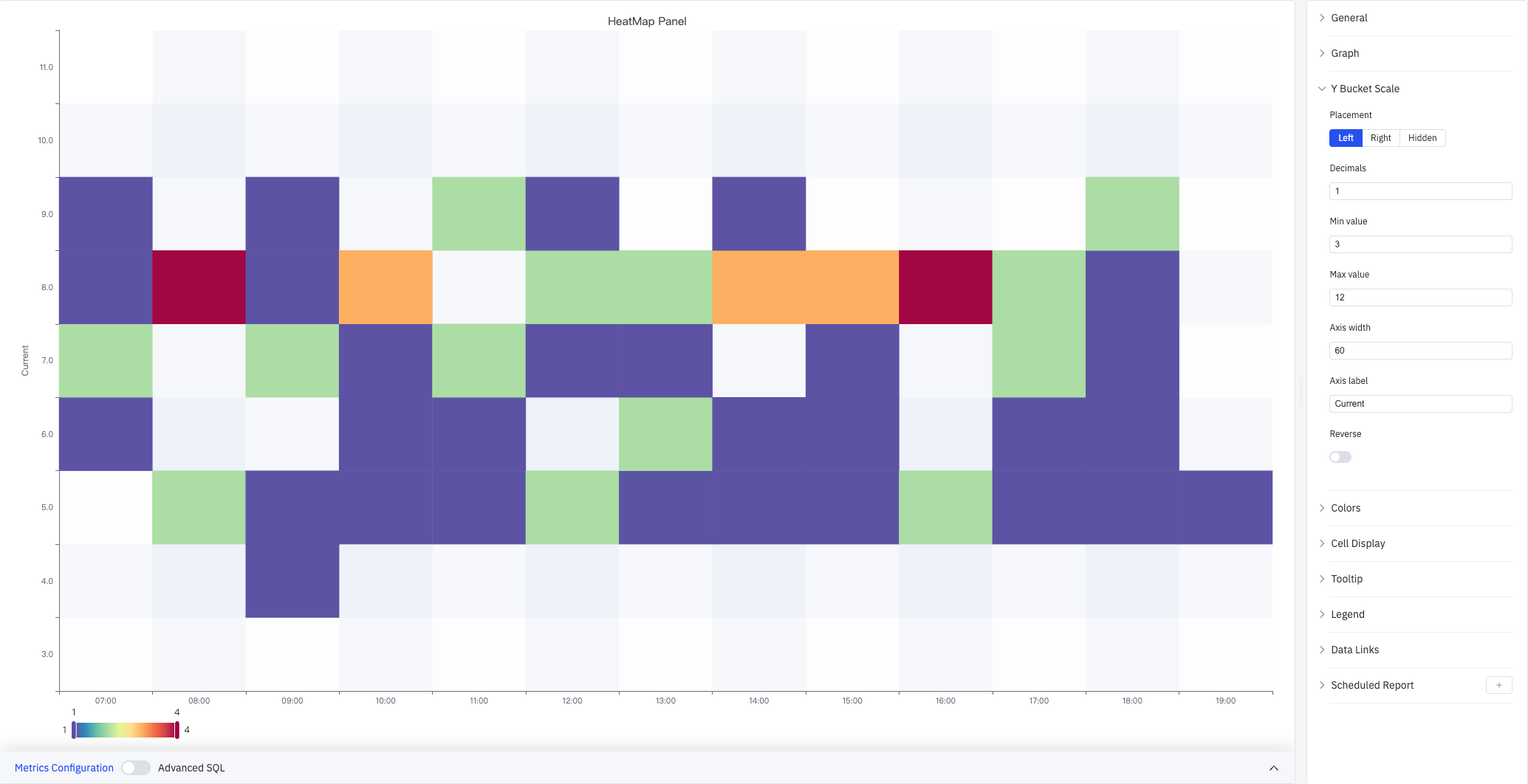
The screenshot shows the Y Bucket Scale panel expanded with the Y axis label set to "Current", Min value 3, Max value 12, and Axis width 60. The left side of the chart displays the "Current" axis label.
| Setting | Description |
|---|---|
| Placement | Where to display the Y axis: Left, Right, or Hidden |
| Decimals | Decimal places for Y axis tick labels (leave blank for auto) |
| Min value | Lower bound of the Y axis display range (leave blank to auto-calculate) |
| Max value | Upper bound of the Y axis display range (leave blank to auto-calculate) |
| Axis width | Width of the Y axis area in pixels (leave blank for auto) |
| Axis label | Custom label text for the Y axis |
| Reverse | Whether to reverse the Y axis direction (large values at the bottom). Off by default |
Colors
Colors settings control how cell density is mapped to color:
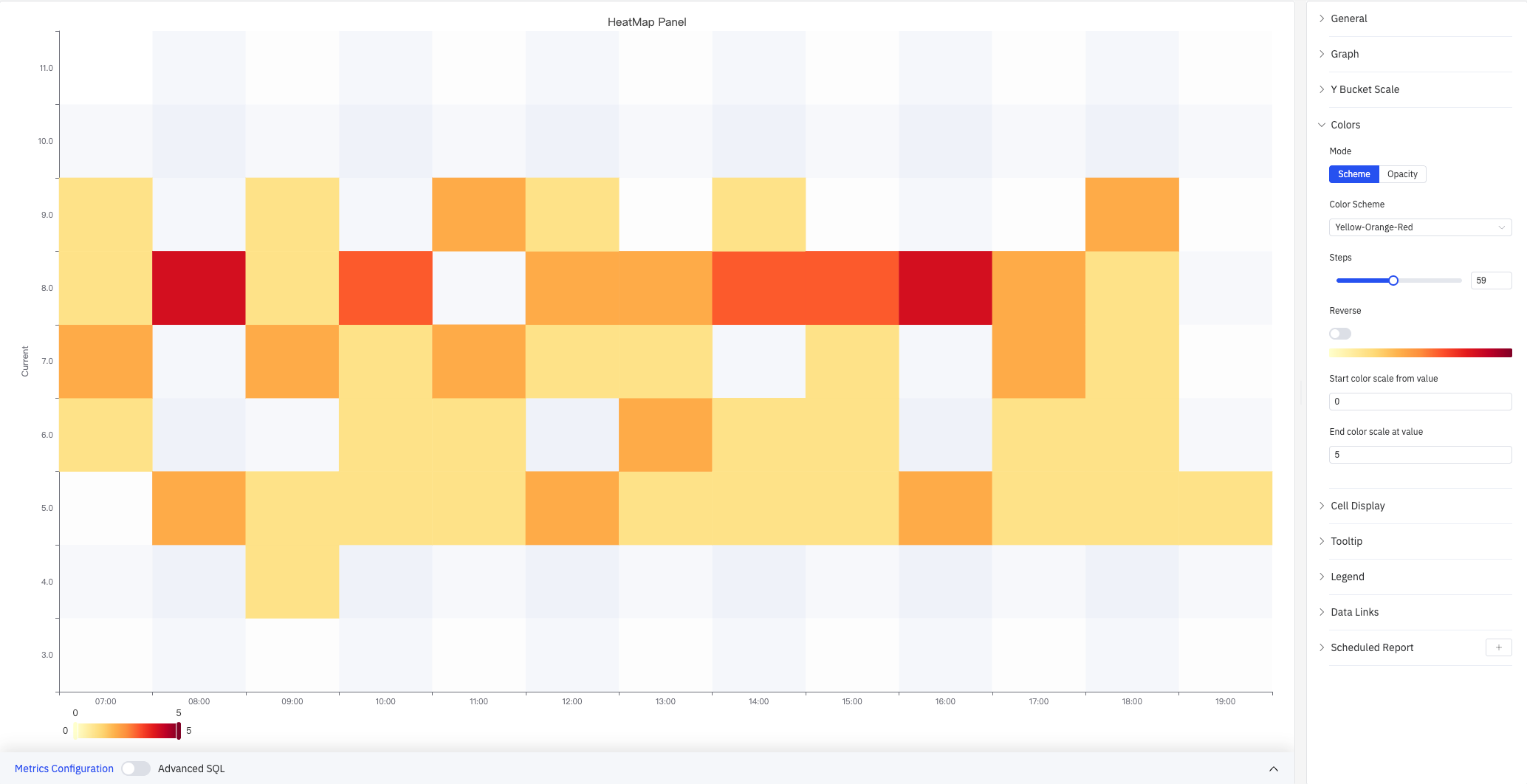
The screenshot sets the color scheme to Yellow-Orange-Red with 59 steps and a fixed scale range of 0–5. The legend bar at the bottom shows the gradient from yellow (0) to red (5).
| Setting | Description |
|---|---|
| Mode | Color mapping method: Scheme (use a preset gradient palette) or Opacity (single color with varying transparency) |
| Color Scheme | Built-in color palette such as Yellow-Orange-Red, Spectral, and others. Available in Scheme mode only |
| Steps | Number of discrete color steps in the gradient (2–128) |
| Reverse | Whether to reverse the gradient direction (swap low-value and high-value colors) |
| Start color scale from value | Minimum value for the color scale mapping (leave blank to auto-calculate from data) |
| End color scale at value | Maximum value for the color scale mapping (leave blank to auto-calculate from data) |
Cell Display
Cell Display settings control cell gap and visibility filtering:
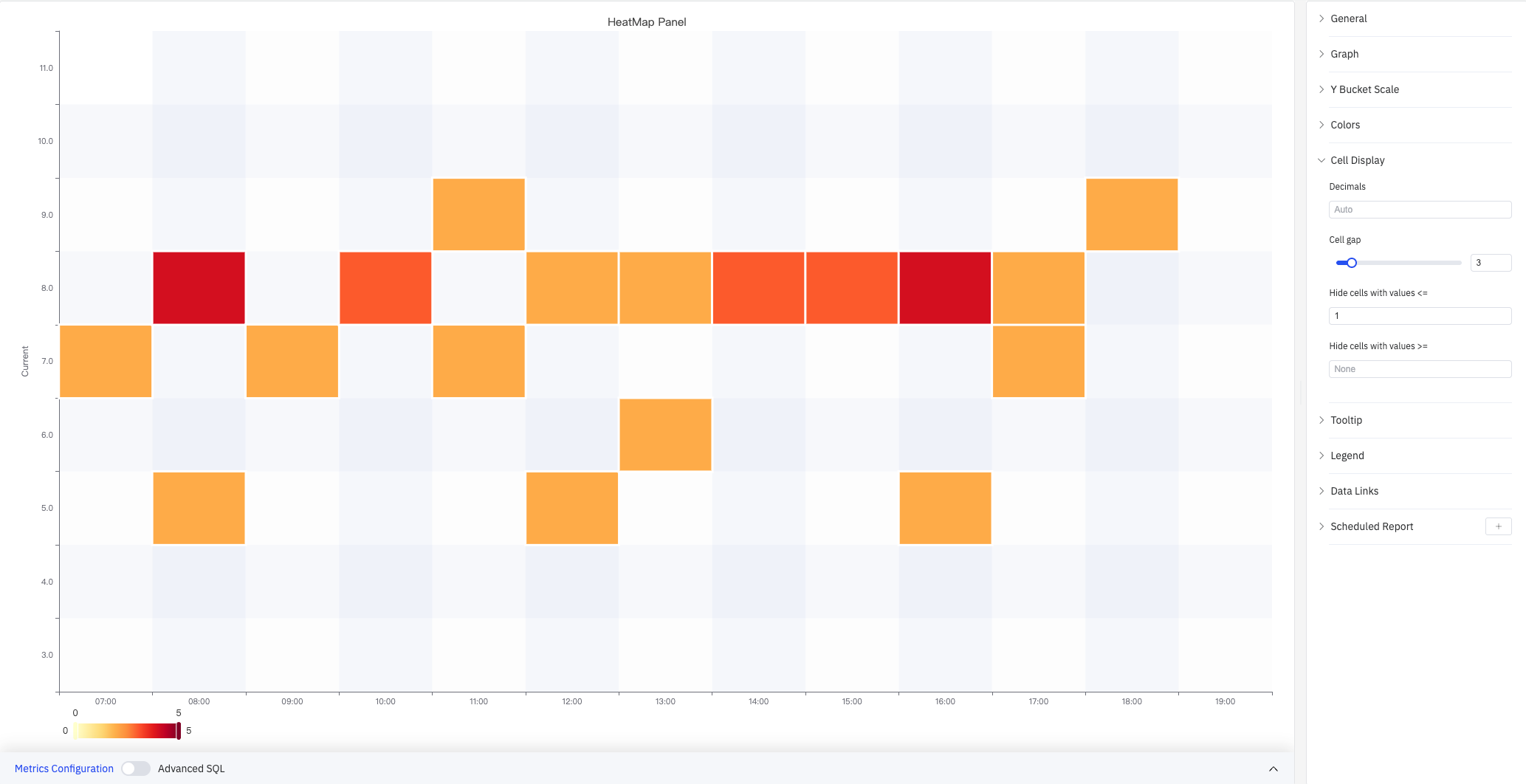
The screenshot sets Cell gap to 3 (a small gap between cells) and Hide cells with values ≤ to 1. Cells with a count of 1 are not colored and appear blank, making high-density areas stand out more clearly.
| Setting | Description |
|---|---|
| Decimals | Decimal places for cell count values shown in tooltips (leave blank for auto) |
| Cell gap | Gap in pixels between adjacent cells (0–25) |
| Hide cells with values ≤ | Cells with a count at or below this value are not colored. Near-zero counts are hidden by default |
| Hide cells with values ≥ | Cells with a count at or above this value are not colored (leave blank for no upper limit) |
Tooltip
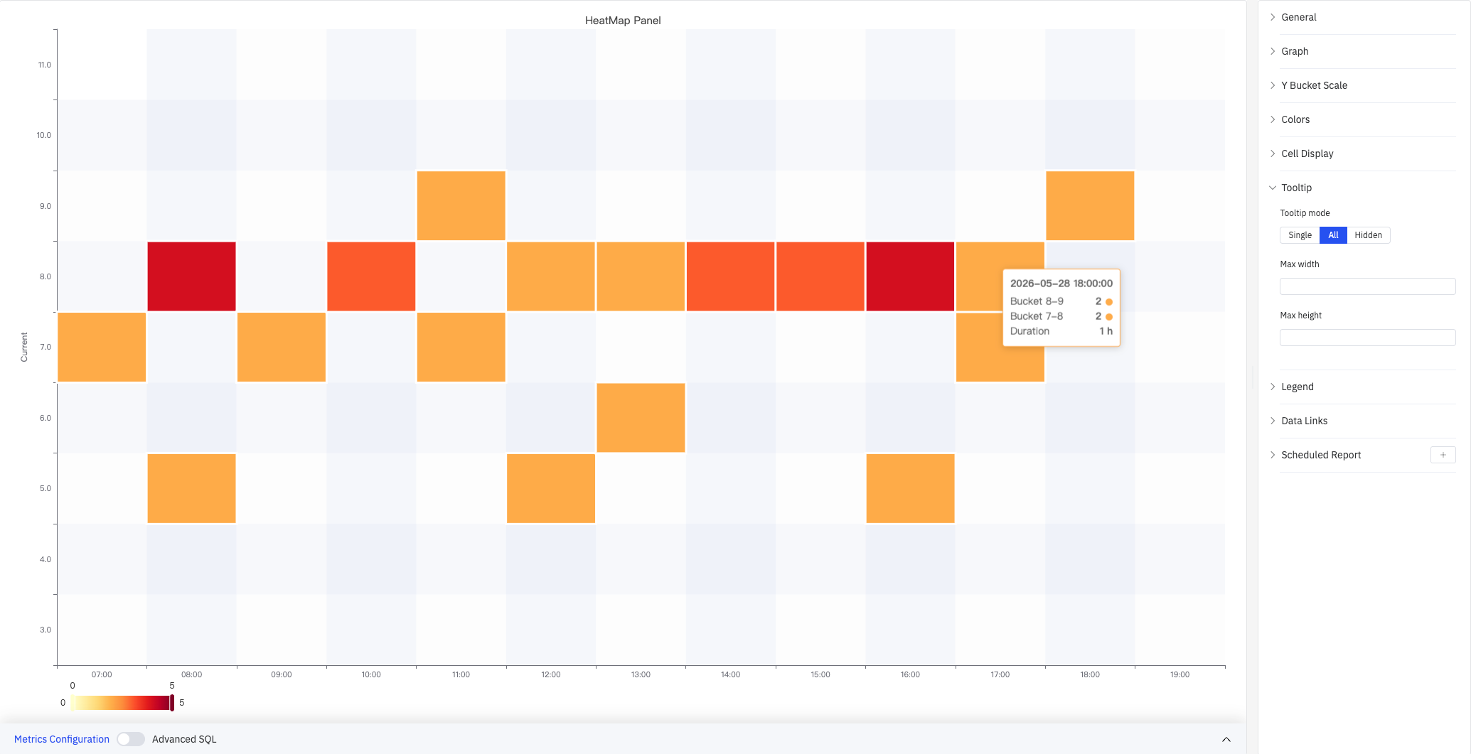
The screenshot shows Tooltip mode set to All. When hovering over 2026-05-28 18:00:00, the tooltip shows: Bucket 8-9 count 2, Bucket 7-8 count 2, Duration 1 h.
| Setting | Description |
|---|---|
| Tooltip mode | Hover display mode: Single (only the hovered row's bucket), All (all buckets in the hovered time column), Hidden |
| Max width | Maximum tooltip width in pixels |
| Max height | Maximum tooltip height in pixels |
Legend
| Setting | Description |
|---|---|
| Show | Display mode: List, Table, or Hidden |
| Placement | Position: Bottom or Right |
| Width | Legend panel width in pixels. Available when placement is Right |
| Legend Values | Statistics shown in Table mode. Multiple selections supported: Max, Min, Mean, Sum, and others |
Data Links
Data Links attach clickable URLs to cells:
| Setting | Description |
|---|---|
| Title | Display name for the link |
| URL | Target URL, supports variable interpolation |
| Open in New Tab | Whether to open the link in a new browser tab |
| One-Click | When enabled, clicking a cell immediately navigates to the URL. Only one link per panel can have this enabled |
Scheduled Report
The Heatmap panel supports scheduled reports, which periodically deliver the chart as an image to a specified email or Feishu group. Access the configuration from the panel's top-right menu.
4.2.12.4 Example Scenarios
Sensor distribution drift detection. A process engineer reviews a quarter of current data as a heatmap (X axis bucketed by day, Y Bucket Count=20 rows). For the first two months, color concentrates in the middle-to-lower rows. Entering the third month, the distribution shifts noticeably upward, suggesting the circuit may have drifted and needs recalibration.
Current daily pattern analysis. An operations analyst views 30 days of current data as a heatmap (X axis bucketed by hour, Y Bucket in Size mode). The map shows that current concentrates in lower ranges every day from 2–4 AM and in higher ranges from 11 AM–1 PM, revealing a recurring pattern tied to production load cycles.
Wide-range data analysis. A maintenance engineer is working with sensor values that span multiple orders of magnitude. Switching Y Bucket Scale to Logarithmic (Log base=2) distributes bucket resolution more evenly across the full value range, making it easier to identify where anomalous values cluster.
Use the Heatmap when:
- You want to observe how the distribution of a process variable changes over time (distribution drift)
- You need to find recurring patterns, such as which shifts or seasons concentrate values in certain ranges
